 Statistics is fun, I promise! But before we can start having all the fun, it is important to describe the distribution of our data. We will need to handle problems differently depending on the distribution.
A histogram is just a graphical way to look at the distribution of our data.
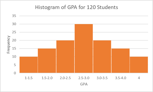
Let’s look at the one below. The x-axis represents our variable of interest, student GPA. The y-axis simply represents frequency for the given x value. We can read from the histogram that 30 people reported having a GPA between 2.5 and 3.0 in our data. This histogram shows that the variable GPA is normally distributed because both sides of the histogram are symmetrical. Hooray!
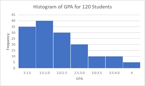
But what if, instead, our histogram looks like this one (below)? This is referred to as right-skewed or positive-skewed because there is a longer tail to the right of the most frequently reported GPA (1.5-2.0). When the variable of interest has a normal distribution, the measures of central tendency, the mean, median, and mode, are approximately equal. However, in a right-skewed histogram, the central tendency measures no longer line up. In the example given here, the median moves a bit to the right (relative to the mode) and the mean shifts even further to the right, while the exact opposite happens in a left-skewed histogram. Because the mean shifts further away from the mode than the median, we see the mean is heavily influenced by observations far from the mode (outliers in our data), while the median is not.
So far, we have visually looked at our data distribution with histograms. We can also get an idea of normality by looking at a statistic called the skewness, which generally pops out when using descriptive statistics programming tools. The skewness tells us the amount and the direction of the skew. If it is a negative number, we have a negative-skew (or left-skew), and if it is a positive number, we have a positive-skew (or right-skew, as illustrated in the histogram above). While this statistic can be a helpful guide when determining distribution of a variable, graphical visualization is always recommended. Why can we not just ignore the histogram and rely on the skewness statistic? Well, in order to declare a variable “non-normal” for the purposes of statistical research, we generally need the variable to be very abnormal. The skewness statistic rarely looks perfect and can lead us to thinking a variable is non-normal when it is actually quite close to normal. We might choose to forgo certain statistical procedures based on the skewness statistic that would be perfectly fine to use in our data.
Now we know we can visualize our data with a histogram and look at the skewness variable to check normality, but why is normality important? Unfortunately, when we have large deviations from normality, some of our handy parametric analytic procedures, such as correlation tests, t-tests, and ANOVA, cannot be used in good conscience.
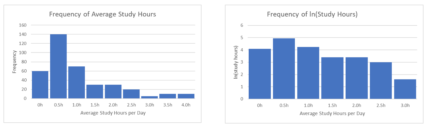
What are we to do when this occurs? Many parametric tests that require (or prefer) the assumption of normality have non-parametric counterparts. For example, for a t-test, in the case of non-normal data, we can instead perform something called a Mann-Whitney test. Another option is to transform the data so that it becomes more normally distributed and apply standard parametric methods to the new data. For instance, when we have a variable with a heavy concentration of values close to zero, we often take the logarithm of the variable to make the distribution normal. The following plots show a histogram before and after logarithmic transformation. Because the one on the right depicts a variable that is no longer obviously non-normal, we are safe to use any methods requiring a normal distribution. The tricky part about transformations comes with interpretation, but that is a topic for another day.
To sum up, it is always important to check what assumptions different statistical procedures require before using them. If one of the assumptions is normality, we must check our data before moving forward. After that, the fun can begin!
Comments