
For the vast majority of humans I’ve met during my time on Earth, statistics is a scary topic, relegated to the brains of nerds. But avoiding this subject altogether may leave you vulnerable to exploitation by the spin doctors who understand how to manipulate a fact into an opinion! Let’s explore simple concepts that can help foster an awareness of what’s real, and what’s conjecture.
A framework for statistics
Our brains love linear relationships between two variables. For example, the hours spent honing my rockstar guitar skills is (hopefully) positively associated with the amount of money I make busking in Harvard square. For relatively simple, measurable outcomes, statistic offers practical ways to test and iterate towards better results.
But the larger (and more meaningful) the question, the more difficult it is to reduce the problem to just two variables. For example: finding the causal roots behind autism, or depression, or the meteoric rise of demagogue leaders in our free world… these phenomena are too complex to be reliably simplified.
Hence my first point: basic (read: college) statistics is easy. It’s limited in its function and is meant as a tool to understand just a little more than we already know. Expecting beyond this is reaching into the realm of God, or Zeus, or Einstein.
The Line: first step towards statistical wizardry
And now let’s delve into my favorite building block of statistics.
Many statisticians loves to work with lines because they are:
- Easiest to make sense of, both for the statistician and his/her/its audience.
- Easiest to create, scrap, and re-create
- Actually quite useful.
Furthermore, even if you use more complex, convoluted models, chances are you want to make the final output as linear as possible to reach the widest possible audience. Our lazy brains love digestible lines more than complex curves!
Lingo for the Linear Model
To be fair, y’all may know these terms from middle school. Who knew algebra could come in handy?
Dependent variable: the thing you care about. The outcome that changes in response to your manipulations.
Independent variable: the thing you manipulate to get more or less of the dependent variable.
Slope: how quickly your desired outcome changes with each change in the manipulated variable. A positive slope means you get more dependent variable by increasing the independent variable; a negative slope means the opposite.
‘r’: a number (from -1 to 1) that expresses how related your variables seem to be. If r is -1 or 1, your two variables can be modeled perfectly using a straight line. If r is 0, your independent variable fails to predict anything about your dependent variable. Real life happens somewhere in between.
A ‘perfect’ example
Here I remind us all that real-life linear models often cannot prove causality; that is, even if r is close to -1 or 1 and indicates that your model is near-perfect, without strict tests in enclosed systems it’s truly a nightmare to prove that your dependent variable changed because of your independent variable!
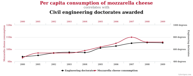 In the above example, r is close to 1 (near-perfect fit). A misinformed human may conclude that increasing mozzarella cheese consumption in our societies will also reliably spawn more civil engineers! Hmm…
Yeah right.
Next steps
Want to check out other random correlations? Go here.
Lines are too uninspiring? Check this If you want to explore where your budding obsession with math and data can lead.
Are you interested in working with JC on statistics or on standardized tests?

Want to read more on statistics from our other bloggers?
Comments